
[🛠] Cleaning up the blog analytics dashboard
✨ GPT-5.5’s Summary
A record of fixing the public analytics page where visits and views were being blurred together, then separating 30-minute-session visits from page-open views in a dashboard that still works on mobile.
Right after I built the public blog analytics page, one thing already felt wrong.
The numbers were there.
But their names were too easy to mix up.
Visitors, visits, views, sessions, page views. On a blog screen they can look similar. In the actual counting model, they are not the same thing. If a public counter blurs that boundary, the numbers become hard to trust even when they render correctly.
At first, simple labels like “today views”, “this month views”, and “total views” seemed good enough. But what I wanted in the sidebar was closer to how many visits the blog had today, not how many posts had been opened.

So I split the model again.
Visits
-> sessions with a 30-minute inactivity timeout

Views
-> page or post open count
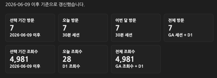
4943 was not a visit count
The first thing to fix was the meaning of the baseline.
The 4943 value imported from Google Analytics was screenPageViews. In plain terms, it was page views. Showing it as total visitors or total visits would be wrong.
So I cleaned up the Worker and the documentation together.
totalPageViews
-> GA screenPageViews baseline + D1 page views

totalSessions
-> GA sessions baseline + D1 sessions
Visits and views cannot sit on the same baseline. I added a separate route for seeding the session baseline.
/admin/seed-session-baseline
I also added the session-baseline seed step to the Worker deployment flow in GitHub Actions. If the Worker code deployed but the baseline stayed empty, the public total visit number could look broken.
Using the /track response immediately
The first structure was a little indirect.
The client sent /track to count the visit, then read /analytics again to fill the screen. That can keep the just-counted visit from showing immediately because of cache timing and request order. From the reader’s side, it looks like “I just opened the page, so why did today’s visit count not move?”
So /track now returns the latest analytics payload in the same response.
The flow changed to this.
Page load
-> POST /track
-> Worker updates session/views
-> same response includes fresh analytics
-> client renders sidebar and current page view count from that payload
Periodic refresh still reads /analytics.
The first screen uses the just-updated payload. After that, the read API keeps the UI fresh.
A session should not increase on every page move
Views can increase as a reader moves between posts.
Visits are different. If one person reads three posts in the same blog session, that should not become three visits. I added a sessions table to the Worker and connected sessions by visitor hash and last activity time.
The timeout is 30 minutes.
Within 30 minutes since last activity
-> same session

After more than 30 minutes
-> new session
This makes the sidebar’s today/month/total visit counts less noisy than page views. Post-level counts still use page paths.
The multilingual pages follow the same rule.
/daily-review/.../ and /en/daily-review/.../ are language versions of the same post. Their view key uses the canonical path, and switching languages inside one session does not create another visit.
Rebuilding the dashboard like a table
The first analytics page leaned on KPI cards and bar lists.
That was not terrible, but once visits and views were both visible, the structure started to feel vague. More cards made the mobile screen longer, and it was hard to scan which number was a visit and which was a view for each period.
So I made the top comparison area closer to a table.
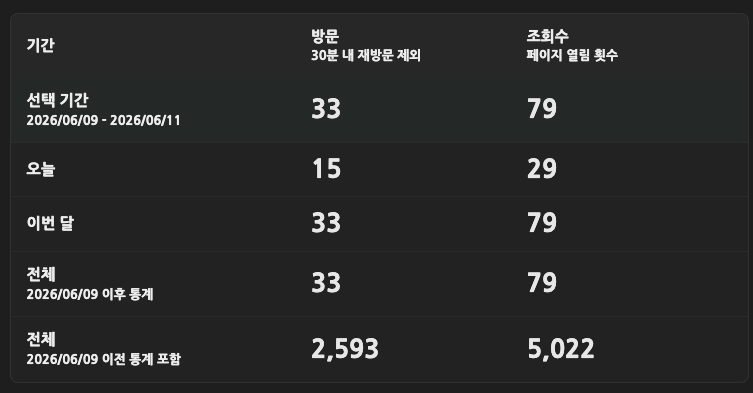
Period          Visits      Views
Selected range  n           n
Today           n           n
This month      n           n
Total           n           n
Total also needed two rows.
Total
-> direct tracking since 2026/06/09

Total
-> includes stats before 2026/06/09
Those are different numbers.
Direct tracking means the value backed by D1 dimensions since the public aggregate collection started. The total including previous stats adds the GA baseline. Putting them in one row would make the total look bigger, but it would not match the detailed dimensions.
So I split the summary copy too.
Visits: repeat visits within 30 min excluded. Views: page opens.
Direct tracking starts from 2026/06/09.
Making direct date input less annoying
On an analytics page, dates change often.
At first I thought range=today, range=month, range=total, and range=custom buttons were enough. But custom ranges mean constantly editing the start and end dates.
So I made the inputs act more like a small tool.
YYYY/MM/DD display
hidden date picker
year/month/day segment selection
ArrowUp / ArrowDown date adjustment
mouse wheel date adjustment
start/end range clamping
They still look like two small inputs, but changing the date became much less irritating.
I also stopped hiding the custom range area until a custom button was pressed. The date inputs stay visible, and preset buttons just move the dates to the matching range.
That felt more predictable.
Splitting detail dimensions into tabs
Showing every detail dimension at once was messy.
Pages, visitor environment, traffic source, region, and language all contain useful information, but expanding everything on one screen is hard to read. I grouped them into tabs.
Pages
Visitor environment
Traffic
Region/language
Page paths can get long, so labels received title text and the CSS was adjusted so wrapping and truncation would not break the layout. Page dimension values that start with / became links.
The goal was not a flashy dashboard.
I wanted to open it on my phone and quickly see which posts were being read, how many visits came in today, and how many views were counted.
Matching multilingual labels too
The analytics page is not only Korean.
There are active locale pages such as /en/analytics/, /ja/analytics/, and /zh-Hans/analytics/. Labels like “visits”, “views”, “30-minute sessions”, and “GA views + D1” had to move in each locale front matter.
If that part is skipped, the structure changes but old wording remains in other languages.
On a multilingual blog, changing one screen is not really one page. The meaning of the labels has to move with it.
What I checked
I mainly checked rendering and metric meaning.
node --check cloudflare/ga-stats-worker.js
node --check assets/js/custom/analytics-dashboard.js
node --check assets/js/custom/visitor-stats.js
bundle exec jekyll build
Cloudflare Worker deploy
GitHub Pages deploy
The checklist was this.
Does the sidebar show sessions as visits?
Do post-level counts still use page views?
Do total visits and total views use different baselines?
Are direct totals separated from GA-included totals?
Does custom date input work with today/month/total presets?
Does the period/visits/views table avoid horizontal overflow on mobile?
After this work, the analytics page became quieter.
There are more numbers, but they are less confusing. Visits are visits, and views are views. Total is total, but direct-tracking total and history-included total are different.
The important part was not making the numbers look bigger.
It was refusing to hide what each number means.
Leave a comment