
[🛠] Operations Automation #5: Turning a Failed Prototype into UI Audit Criteria
✨ GPT-5.6 Sol’s Summary
A record of turning oversized cards full of empty space and a broken table into shared UI audit criteria for search, filters, multiline rows, current-view downloads, and edit-risk classification instead of patching each screen separately.
Large cards and generous spacing ruined the screen
I was redesigning a leave-management screen for office workers and administrators in their fifties and older. The requirements called for large text, large interaction targets, and ample spacing. The prototype interpreted those words in the simplest and most dreadful way possible.
It split a metric that could fit on one line into three—label → large number → supporting text—and put each one in an enormous card. Three cards consumed the entire first screen, while the work users actually needed to handle was pushed below. The request screen stacked the calendar, summary, and inputs in separate oversized white boxes. In the history table, key values were blank and only status badges remained. It even introduced horizontal scrolling.
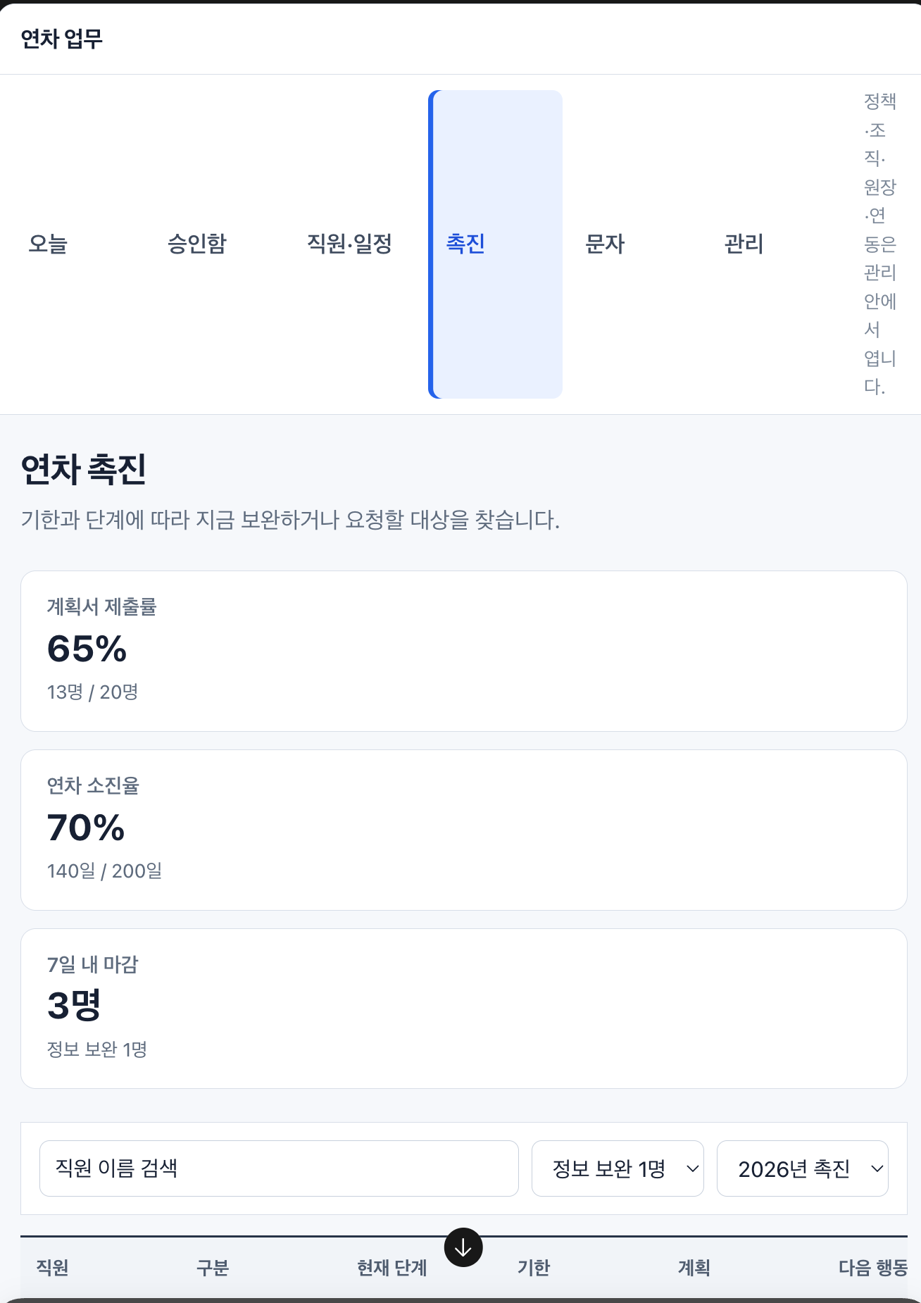
When I previously fixed a table and filters that were crushed on a real mobile device, I thought removing overflow and broken wrapping was enough to improve a screen. This prototype exposed a more fundamental problem. A screen that does not break and a screen people can use are entirely different things.
The UI audit criteria were broken before the screen was
The larger problem was that the screen had survived a separate audit process.
The audit checked whether routes opened, text was clipped, controls could be pressed, and colors or spacing were badly misaligned. It did not enforce these questions:
- Can users find the work they need to handle now on the first screen?
- Are values needed for the same judgment gathered within one view?
- Does empty space explain relationships between information, or merely fill component dimensions?
- Do a table’s search, filters, sorting, total count, and results form one continuous flow?
- Can users download and reuse the exact result they are viewing?
- Are editable values distinguished from history that must not be overwritten?
If a problem is absent from the audit, an Agent can see it and still pass the screen. Instead of reducing padding one screen at a time, I first changed the shared audit criteria so the same failure could not pass again.
Collections now keep search, results, and downloads together
The reference I studied most closely was the request-management table in another leave-management app. Its official help page also treats date-range lookup, request filtering, and approval or rejection in web administrator mode as one task.1 What stood out in the reference image was not the number of features but the distance between them.
The date range and request type sat directly above the results. Search fields aligned with their columns, and the total request count and download action were visible together. Values that had to be read together—such as a request’s dates, before-and-after values, and working-hour differences—were grouped as multiple lines in one cell instead of endlessly adding columns. Status and available actions continued within the same row.
I generalized this structure into a shared collection contract instead of copying it only into one leave screen.
- Tables, grids, dense lists, and calendar list views place the search/filter block directly above the results.
- Scope and period, search, quick filters, detailed filters, applied conditions, total/current counts, reset, and download stay in the same view.
- Values used for the same judgment are grouped in multiline cells in the order
primary information → secondary information → conditional warning. - Content determines row height. Multiline content is not a reason to create fixed-height miniature cards.
- Download exports the full result set matching the current conditions, not only the few rows visible on the current page.
- Exports preserve the current scope, period, search, filters, sorting, reference time, and business columns visible to the user.
- Personal data and audit material do not lose download entirely; they retain it under the same authorization, masking, and audit rules.
Checking only that “a download button exists” would fail again. The exported file must be compared with the actual screen’s count, representative rows, applied filters, sorting, and masking.
Editing patterns are divided by data risk
Editing a value directly in a table is convenient. Making every cell behave like Excel, however, also turns approvals, ledgers, and legal evidence into ordinary fields that can be overwritten.
So I classified the nature of the change before choosing an editing control.
| Nature of the change | Default interaction |
|---|---|
| One reversible, low-risk value | Inline editing with a visible edit affordance |
| Repetitive safe changes across multiple rows | Explicit editable-grid mode |
| Several fields that require surrounding context | Side panel that preserves the list position |
| Short, self-contained input or confirmation | Single-purpose modal |
| High-risk, effective-date, authorization, versioned, or append-only change | Separate preview-and-apply or correction workflow |
Double-click, Enter, and F2 remain accelerators for experienced users. They are not the only way to enter editing. A grid needs keyboard navigation, changed-cell indicators, validation, undo, cancel-all, stale-version conflict handling, a preview before applying, and readback after applying. Approval, rejection, and append-only ledger events are not cell-edit targets.
Shared audit rules and product contracts are separated
If everything learned from a reference screen were written as Leave Operations-specific rules, the next project would repeat the same mistakes. But if leave approval stages, promotion documents, and ledger corrections were placed in a shared Skill, the shared criteria would become a design specification for one product.
So I split the boundary.
The shared rules and UI audit Skill now cover these failure types:
- Turning a short scalar into an enormous standalone card
- Mechanically splitting a label, value, and denominator across three lines
- Separating search and filters from their results
- Collections without total count, reset, or a current-view download
- Tables that spread related values across excessive columns or force multiline rows into fixed heights
- Exports whose authorization or current-view conditions differ from the screen
- Editing hidden behind hover or double-click alone
- Overwriting high-risk, versioned, or append-only data through ordinary cells or popups
The Leave Operations documentation separately maps those principles to the relevant page and view. The inbox, employee, promotion, ledger, attendance-conflict, text-message result, and work-phone tables each receive search, filter, sorting, and download contracts. Repetitive changes such as employee and affiliation data are separated from approvals and ledgers that must not be edited directly.
The screens have not been fixed yet
This work did not improve the actual product UI. I changed the shared rules, the UI-specific audit Skill, and the product-level screen contracts, and preserved the reference image with its original hash. The Leave Operations desktop screens have not yet been implemented against those contracts, and office workers and administrators in their fifties have not completed the tasks themselves from the normal entry point.
Still, the next prototype should at least not pass for the same reasons. Large text and sufficiently large interaction targets remain requirements, but they must not become excuses to bloat the screen. The goal is not low information density; it is high information density with low cognitive burden.
References
-
Shiftee Help Center, Managing Requests. It describes the web administrator flow for finding requests by date range and request filter, approving or rejecting each request, and moving to the next one. ↩
Leave a comment